UI/UX, and assorted artistic oddities.
"Design"
The quotes are intentional.
I'm not a designer by trade, and rarely take on freelance art or design projects these days (not opposed to it, though). My original background and interests prior to going down the programming rabbit hole were based in art and animation, though, so I'll likely always tinker on this side of things. I tend to put my work up on Dribbble and echo it here.
-
 Thu 01 July 2021
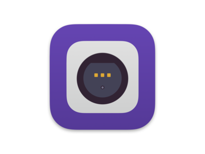
DriverKit Icon
Been working on a DriverKit port of an old-school kernel extension for macOS that handles Gamecube controller adapters (i.e, if it reports as one, it'll read it). DriverKit drivers are different than kernel extensions, and require shipping as a lightweight app - and so I wanted a fun icon that communicated the purpose. Pretty happy with this one.
-
 Fri 25 June 2021
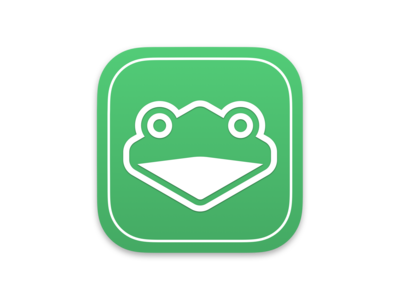
A Certain Green Frog
Originally thrown together due to wanting a custom macOS-specific icon, wound up being the default icon for the Slippi Launcher for the moment (massive props to the Slippi devs for the work they do).
-
 Sun 09 February 2020
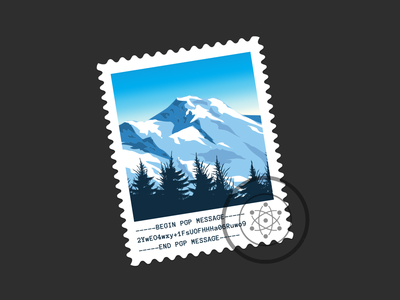
Protonmail MacOS Desktop Icon
Protonmail is a bit unlike other email services - if you want a solid desktop app, you're pretty much either running the Bridge or running it in a browser tab. I'm not a bridge user, and I regularly get into tab hell - so running it in a tab isn't my ideal scenario.
Thus, I wrote up a simple wrapper app for the website that hooks in to get proper notifications, mailto:// support, and so on. Email is too important to live in a browser tab, especially if your muscle memory is built up to have it on your dock/switcher/etc.
My eyes got used to the Mail.app icon over the years, so I opted to fashion an icon in that general style. It tries to evoke that weird "free" feeling the stock Mail.app icon has, while containing nods to the service and purpose itself (e.g, the mountains of Switzerland, PGP encryption, and the stamp itself).
I also didn't want to go with the same generic glyph style that most apps opt for these days - Mac icons used to be better! Overall pretty happy with the results.
(This is in no way affiliated with Protonmail themselves.)
-
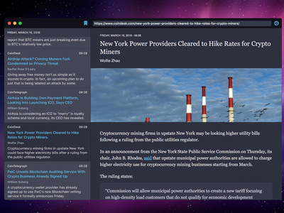
 Sun 25 March 2018
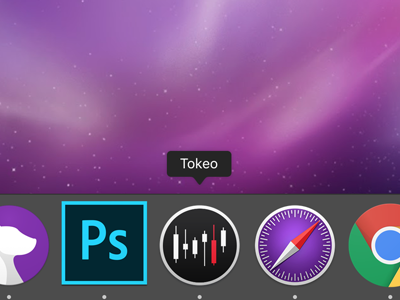
Tokeo Dribbble Icon
Recently launched a simple news tracker for cryptocurrency RSS, and named it Tokeo. After living in Tokyo proper, the iconic thing you always remember is Tokyo Tower... and since cryptocurrency always seems to be crashing for one reason or another, this just seemed a fitting icon.
App, if anyone's interested: https://tokeoapp.com/
-
 Sat 17 March 2018
Tokeo - Cryptocurrency Desktop News App
I wanted to kill the tab-hell that is my browser when looking through Cryptocurrency news, and wound up putting together a simple RSS reader to manage it all. It's more optimized around the existing crypto news sources and sends push notifications as new articles come up.
Part of the incentive for building this was also to look at how easily I could build a framework that'd support native code on both iOS and macOS. In the end it worked, albeit it's not easy. App syncs bookmarks with iCloud and should be available in the App Store soon.
Also, yes, that's the Snow Leopard background. Apps look amazing on that backdrop.
-
 Sat 19 August 2017
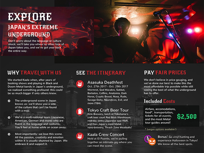
Tri-fold Brochure Inner
For a project I worked on for a bit - a site that brings Japan's metal scene to the world. No longer touching it these days but this tri-fold brochure I put together at the end for a tourism project was fun, figured it's worth showing off.
-
 Sun 27 March 2016
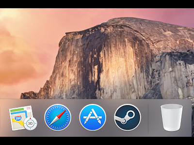
OS X Steam Icon
The Steam interface doesn't feel at home on OS X in the slightest. Someone made a great Yosemite skin that helps a lot, but it was lacking an icon - figured I'd take a shot at making one that actually fits in. Mimics the designs found on the Safari/App Store icons with the classic Steam icon front and center, slightly subdued colors from the current icon. If you're interested you can download the icon here as an OS X icon.
-
 Mon 14 October 2013
Feed
Took the existing feed for this app and... enhanced it to show actual visual previews, with a slightly flatter design. Given the target market it actually seems to work/perform the best - go figure.
-
 Fri 28 June 2013
App Intro Preview
I wanted an intro for this app that I'm working on that stood out, and thought the way Facebook used video for their "Home" or whatever page was pretty neat. Basically used that trick with buttons and some animations to tie it all together.
Not sure Dribbble can really relate it, or maybe I'm failing with words, who knows.
-
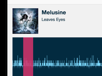 Wed 19 June 2013
Selecting chunks
Trying to determine an elegant way to select a sub-section of a music track for analysis on a touch device. It's more or less locked to ~10 seconds and just drags/drops the pink bar, but... something is missing.
I'm just not sure what.
-
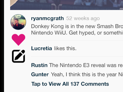 Tue 18 June 2013
iOS Feed Entry
Takes inspiration from Vine/Instagram's feed layout to showcase commenting and likes. I wanted to make things a bit shorter overall so I'm experimenting with the icons on the left - not sure it works how I want it to, but oh well.
-
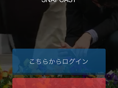
 Mon 20 May 2013
Dashboard
Some days it feels like I have to context switch between three languages, in addition to programming in many more. Mucks with the brain and the ability to lay things out.
Preview of a dashboard concept I'm working on for a friend.
-
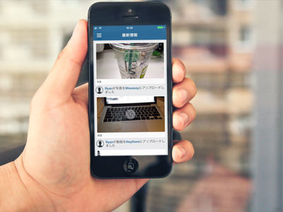
 Sun 19 May 2013
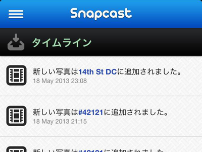
Feed View
Screenshot of an application I'm working on for the Japanese market. Needed a feed really quickly, threw together something basic with the aid of the hella nice Batch icon set (users can upload either photos or videos).
Not 100% happy with it, but it gets the job done for right now.
-
 Wed 12 September 2012
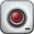
Just a Camera Icon
Very basic, but an icon for an app I decided to tool around with in my spare time. Based off some open source PSDs - what do you think of when you look at it?